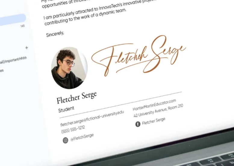
You’ve probably spent hours designing the perfect email signature — picked colors, chose fonts, maybe even added a calligraphy signature for that personal touch. Then you hit send, and everything looks… off. Logo squished, banner cut off, images taking forever to load.
Dimensions matter. Not because of some abstract design principle, but because your signature travels through dozens of email clients, each with its own quirks. What looks sharp in Gmail might break in Outlook. What loads instantly on desktop might crash on mobile.
Let’s fix that.
Table of Contents
Optimizing Email Signature Image Sizes
Getting image sizes right isn’t about following rules — it’s about understanding what happens when someone opens your email.
Why Size Matters in Email Signatures
Here’s what most people miss: email clients don’t just display your signature. They resize it, compress it, sometimes reject it entirely.
A 2MB headshot? Outlook will strip it out. A 50x50px logo? Unreadable on retina displays. A 800px-wide banner? Cut in half on mobile.
Every email client has limits. Gmail caps images at 10MB total, but good luck loading that on a 4G connection. Apple Mail handles large files better, but compresses them aggressively. Outlook — the worst offender — sometimes just shows a red X.
Size affects three things: deliverability, load time, and how professional you look. Get any wrong, and your signature becomes a liability.
File Size Impact on Email Loading
You send 50 emails a day. Each has a 500KB signature. That’s 25MB of bandwidth — just for signatures. Multiply by everyone in your company.
Recipients notice slow loads. They don’t think “big file” — they think “this person’s emails are slow.” Then they start ignoring them.
The sweet spot? Under 50KB for the entire signature. Under 20KB is better.
Heavy images do something worse than slow loading — they trigger spam filters. Email providers look at message size. A 5KB text email with a 1MB signature? Suspicious. Straight to the spam folder.
File size creeps up fast. A PNG logo at 300x100px might be 80KB. Add a banner, social icons, maybe a headshot — suddenly you’re at 200KB. That’s before compression.
How Size Affects Brand Perception
Your signature runs on autopilot. Every email, every reply, every forward — it represents you.
A pixelated logo tells people you don’t sweat the details. An oversized banner screams “I don’t know what I’m doing.” Images that don’t load? You look unprofessional.
Brand consistency lives in dimensions. Your logo should be recognizable but not overwhelming. Banners should complement, not dominate. Everything needs to scale properly across devices.
Think about the last signature that impressed you. Probably clean, compact, readable. Nothing fighting for attention. That’s intentional sizing at work.

Recommended Logo Dimensions
Logos are tricky. Too small, and nobody sees them. Too large, and they dominate everything else.
Ideal Logo Sizes
Start with 300x100px maximum. That’s width by height. Most logos fit comfortably in this space.
Horizontal logos? 300x80px works. Square logos? Try 100x100px. Vertical logos are tough — 80x120px at most, or they’ll push everything down.
Actual file dimensions should be double what displays: 600x200px saved, displayed at 300x100px. This handles retina displays without making files huge.
Why these numbers? Email clients render signatures in a narrow column — usually 500-600px wide. Your logo should take up about half that, max. Leave room for text, contact info, other elements.
Different logo orientations need different approaches. Wide logos scale better. Tall logos need height restrictions or they’ll dominate mobile screens.
Scaling Logos Without Quality Loss
Never stretch a logo. Ever. If your source file is 400x200px, don’t display it at 300x150px — the proportions change.
Use the original aspect ratio. A 2:1 logo stays 2:1 whether it’s 300x150px or 200x100px. Email clients will maintain this if you set width OR height, not both.
Work from vector files when possible. Export at 2x display size. A logo showing at 250px wide? Export the PNG at 500px wide. This gives you retina-ready images without massive file sizes.
Test at different sizes before committing. What looks good at 300px might lose detail at 150px. Fine details disappear first — thin lines, small text, intricate shapes.
Choosing Logo File Formats
PNG with transparency — that’s your default. 24-bit PNG handles colors well, transparency perfectly, and compresses reasonably.
JPEG for photos or complex gradients. But logos with text? PNG wins. JPEGs create artifacts around sharp edges. Text becomes fuzzy.
SVG is tempting — infinitely scalable, tiny files. But email clients block them. Outlook doesn’t display SVG at all. Gmail strips them. Stick with PNG.
For file size, run PNGs through compression. Tools like TinyPNG or ImageOptim cut 60-70% without visible quality loss. A 80KB logo becomes 25KB. Same appearance, faster load.
Save at the right color depth. Most logos don’t need millions of colors. PNG-8 with 256 colors often looks identical to PNG-24 but at half the size.
- Say goodbye to messy scribbles
- Get a sleek, confident signature in days
Optimal Banner and Element Sizes
Banners are promotional space in your signature. Use them wrong, and they’re spam. Use them right, and they drive clicks.
Banner Dimensions for Better Click Rates
Standard banner: 600x100px maximum. That’s the width most email clients allocate before wrapping or cutting off content.
Narrow banners work better — 600x70px or 600x80px. They don’t overwhelm the signature. Recipients can see your contact info without scrolling past a billboard.
Mobile changes everything. Those 600px? They become 320-375px on phone screens. Design for that width first. Text should be readable at 320px. Calls-to-action should be tappable.
Banner placement matters as much as size. Bottom of signature works best — contact info first, promotion second. Top placement competes with your name and title.
Clickable areas need space. A button in your banner should be at least 44x44px — Apple’s minimum touch target. Smaller, and people miss it on mobile.
Creating Banners Within Email Constraints
Email clients strip fancy code. No hover effects, no animations, no complex layouts. Your banner is just an image and a link.
Keep text large — minimum 14px font size, 16px is safer. Small text becomes unreadable when scaled down.
Contrast matters more in email than on websites. Light text on light backgrounds disappears in preview panes. High contrast ensures readability across email clients.
Stick to web-safe colors. Email clients render colors differently. That perfect brand teal? Might look blue in Outlook, green in Apple Mail. Test across clients.
File size limits hit banners hard. A 600x100px banner shouldn’t exceed 30KB. Use solid colors instead of gradients where possible. Compress aggressively. Every kilobyte counts.

Technical Aspects of Email Signature Resolution
Resolution determines whether your signature looks sharp or blurry. Get it wrong, and even perfect dimensions won’t save you.
Image Resolution Impact
Email signatures display at 72 DPI (dots per inch) — standard screen resolution. Print uses 300 DPI, but that’s irrelevant here.
What matters: pixel dimensions and how they render on different screens.
Retina displays show 2x the pixels. A 300px logo on a regular screen becomes 600 logical pixels on retina. If your source image is only 300px, it looks blurry.
Solution: create images at 2x size, display at 1x. A logo displaying at 200x80px should be saved at 400x160px. HTML or CSS scales it down, giving you crisp retina display.
Most email clients handle this automatically if you set display dimensions correctly. Some don’t. Test on actual devices — Macs, iPhones, high-res Windows machines.
Best Image File Formats
PNG for anything with transparency or text. Logos, icons, buttons — PNG handles them without artifacts.
JPEG for photographs only. A headshot, a product photo — JPEG compresses these better than PNG. But keep quality at 80-85%. Lower, and faces look weird.
GIF works for simple graphics and supports animation, but animated GIFs in signatures? Distracting and often blocked. Stick to static images.
WebP offers better compression, but email client support is spotty. Outlook ignores WebP entirely. Gmail handles it. Not worth the risk unless you’re only targeting Gmail users.
Never use BMP, TIFF, or other exotic formats. They’re either too large or unsupported.
Reducing File Size Without Quality Loss
Compression is non-negotiable. Original exports are always larger than necessary.
For PNG: use tools like TinyPNG, ImageOptim, or Squoosh. They optimize the file structure without changing pixels. A 100KB logo becomes 30KB with zero visible difference.
For JPEG: export at 80-85% quality. The difference between 100% and 80% is invisible to most people but cuts file size in half.
Reduce color palette for PNGs. If your logo uses 10 colors, why save it with millions? PNG-8 with a limited palette is dramatically smaller.
Crop unused space. That 800x200px logo with white space on both sides? Crop it to 600x150px. Less pixels = smaller file.
Remove metadata. Image files contain EXIF data, color profiles, and other info you don’t need. Strip it all. Tools like ImageOptim do this automatically.

“Ge-Sign created my new email signature, and it looks professional while loading instantly.”
Kevin F., Realtor
Testing and Adapting Email Signatures
Your signature works in your email client. Great. But what about the other dozen clients your recipients use?
Importance of Testing Email Signatures
Outlook Web versus Outlook Desktop versus Outlook Mobile — three different rendering engines, three different results.
Gmail on Chrome, Gmail on Safari, Gmail app on iOS — all slightly different.
Apple Mail, Thunderbird, Yahoo Mail, Proton Mail — each has quirks.
Testing isn’t optional. Send test emails to accounts on different platforms. Check desktop and mobile. Look for:
- Images loading correctly
- Dimensions holding steady
- No weird spacing or gaps
- Links working
- Text remaining readable
Common failures: images stretched in Outlook, banners cut off in Apple Mail mobile, spacing issues in Gmail app.
Use testing tools like Litmus or Email on Acid if you’re sending signatures company-wide. They show previews across dozens of clients simultaneously.
Manual testing works too — just time-consuming. Create free accounts on major providers. Send yourself test emails. Check on your phone.
Adapting Signatures for Mobile Devices
More than 50% of emails open on mobile. Your signature needs to work there first.
Mobile screens are 320-428px wide. That 600px banner? Scales down to fit. Text becomes tiny. Images lose detail.
Design with a mobile-first mindset:
- Keep total signature width under 500px
- Use larger font sizes (16px minimum)
- Make clickable elements at least 44x44px
- Stack elements vertically when possible
- Test on actual phones, not just browser resize
Images should scale proportionally. Set max-width to 100% in HTML. This lets email clients shrink images to fit screens without breaking layout.
Consider mobile data speeds. That 200KB signature? Takes seconds to load on slow connections. Recipients scroll past before it appears.
Some companies create separate mobile signatures — simpler, smaller, faster. Double the work, but ensures great mobile experience.
Avoiding Display Issues
Email clients break signatures in predictable ways. Here’s what goes wrong and how to prevent it:
Tables, not divs. Email HTML is stuck in 2005. Use table layouts for structure. Divs and modern CSS often fail.
Inline styles only. External stylesheets get stripped. <style> tags get ignored. Put styles directly on elements: <td style="padding: 10px;">.
Absolute image URLs. Link to images hosted on a server, not attached files. Attached images may not display in replies or forwards.
Alt text for everything. When images don’t load (blocked by client or slow connection), alt text shows. Makes signatures readable without images.
No background images. Outlook ignores them. Use solid colors or regular images instead.
Test link formatting. Some clients auto-format URLs, breaking styled text links. Always check linked text appears correctly.
Avoid exotic fonts. Web fonts don’t work. Stick to system fonts: Arial, Helvetica, Georgia, Times. They display everywhere.
Watch line height and spacing. What looks good in your editor might render with extra gaps in Outlook. Use specific pixel values for spacing.
Your email signature isn’t static — it’s code traveling through hostile territory. Every client interprets it differently. Proper dimensions and file sizes give you the best chance of looking professional everywhere.
Start with these specs:
- Logos: 300x100px max, under 20KB
- Banners: 600x80px max, under 30KB
- Total signature: under 50KB
- All images: 2x pixel density for retina
Test everywhere. Adjust based on what breaks. Your signature represents you in hundreds of emails. Make it count.
Written by the Ge-Sign Editorial Team.


