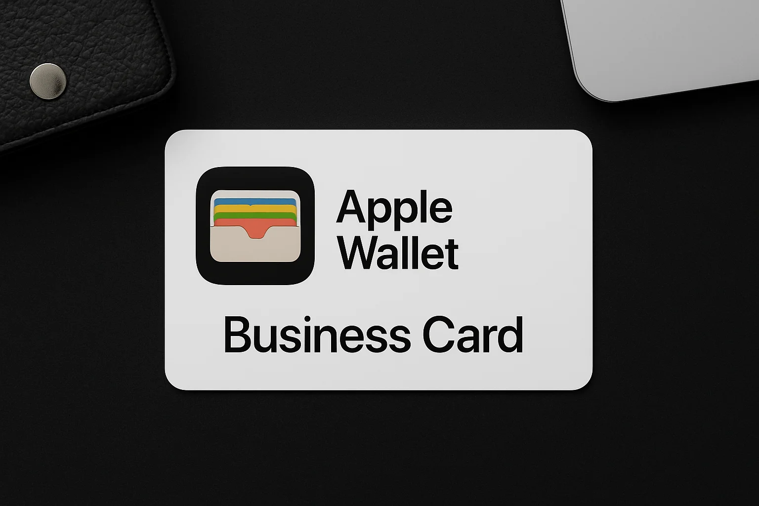
sale -60%
Business Card

How to Choose the Right Business Card Font: 30 Pro Fonts That Impress

July 30, 2025
Choosing the right business card fonts for professional branding is crucial for making a memorable first impression. In this ultimate guide to selecting effective business card typefaces, we’ll show you how to pick fonts that boost readability, capture your brand’s personality, and make your card stand out in competitive markets. Backed by trusted research and expert tips, this article will help you create business cards that connect and convert.

Why Choosing the Right Business Card Font Is Essential for Branding and Readability

Your business card is often the first physical connection with potential clients or partners. Choosing clear, professional fonts helps your card communicate trust and memorability. Studies from the University of Minnesota prove that legible typography increases brand recall and trust—key factors in networking success. Avoid fonts that make your details hard to read or seem cluttered. Instead, opt for fonts that speak professionalism and respect for your audience’s time.

Ge-Sign perfectly captured my brand’s voice with the right fonts, making my cards stand out instantly.”

Thomas H., Architect

How to Select the Perfect Business Card Typeface

When selecting your business card font, consider:

Professional signatures offer multiple benefits:

  • Readability at Small Sizes: Fonts like Helvetica, Georgia, and Arial remain clear and legible even at 7–14 pt, making them perfect for business card design.
  • Matching Brand Personality: Serif fonts such as Times New Roman and Garamond communicate tradition and authority, while sans-serifs like Montserrat and Lato feel modern and clean. Script fonts add creativity when used subtly.
  • Effective Font Pairing: Create a visual hierarchy by combining a bold sans-serif font for your name with a clean serif for contact details. This improves readability and brand perception.
  • Print and Digital Compatibility: Choose typefaces that render well on both screens and textured paper stock to ensure consistency across platforms.

According to the U.S. Small Business Administration, well-designed business cards increase brand recognition by up to 40%.

30 Most Popular Business Card Fonts

Here are the top 30 fonts trusted by professionals for business cards:

  1. Helvetica – A modern sans-serif font known for its exceptional readability and clean design.
  2. Arial – A simple, friendly typeface that’s widely used for its versatility and legibility.
  3. Times New Roman – A classic serif font that conveys trust, tradition, and professionalism.
  4. Georgia – A warm serif typeface that offers elegance and great performance in print and digital.
  5. Garamond – A timeless, sophisticated serif font perfect for upscale branding.
  6. Futura – A minimalist geometric sans-serif with a clean, structured appearance.
  7. Baskerville – A refined serif font with strong contrast, ideal for elegant visual branding.
  8. Montserrat – A bold, urban sans-serif font popular in modern creative industries.
  9. Lato – A well-balanced and versatile sans-serif that works across business categories.
  10. Raleway – Sleek, stylish, and contemporary—great for bold headings.
  11. Proxima Nova – A modern font that blends geometric precision with a tech-inspired vibe.
  12. Open Sans – A neutral, clean font optimized for legibility on screens and in print.
  13. Roboto – A mechanical sans-serif with a touch of warmth, great for digital branding.
  14. Avenir – A timeless geometric font offering strong balance and elegance.
  15. Didot – High contrast and classic beauty—ideal for luxury-focused branding.
  16. Century Gothic – Clean, minimalist, and widely used in modern layouts.
  17. Calibri – A familiar font in corporate settings, known for its readability and neutrality.
  18. Gill Sans – Approachable and timeless, with a distinct British charm.
  19. Franklin Gothic – Bold, confident, and effective for headlines or names.
  20. Verdana – Screen-optimized for clarity, making it ideal for digital business cards.
  21. Source Sans Pro – A versatile, open-source font perfect for startups and developers.
  22. Merriweather – A warm, highly readable serif font designed for digital comfort.
  23. Playfair Display – Stylish and expressive—perfect for attention-grabbing headings.
  24. Museo Sans – A strong, creative font that adds a unique personality to your card.
  25. Tahoma – Clean, compact, and effective in tight layouts.
  26. Ubuntu – A friendly, contemporary sans-serif font created for global use.
  27. Cambria – Designed for screen and print clarity—ideal for professional text.
  28. Bebas Neue – A tall, uppercase font that demands attention and impact.
  29. Poppins – Rounded and modern, perfect for creative professionals and startups.
  30. Quicksand – Casual yet polished, offering a professional tone with a human touch.

This panel is where you’ll manage everything related to your email signature.

Business Card Font Sizes for Maximum Impact and Readability

Choosing the right font size for a business card isn’t just a design detail — it directly impacts how professional, readable, and trustworthy your card appears. If your contact info is too small, it’s ignored. If it’s too large, it looks cluttered. Here’s how to strike the perfect balance.

Recommended Font Size Ranges

For the main contact information (name, phone, email, title), use a font size between 8 and 12 points. This range ensures your text remains legible without overwhelming the limited space on a standard 3.5 x 2 inch business card.

According to MIT AgeLab studies, fonts below 7pt significantly reduce readability in low light or for older readers.

Minimum Font Size

If you need to include more information, you may reduce the size slightly, but avoid going below 7pt. Anything smaller can become unreadable, especially on textured or glossy cardstock.

Use Larger Fonts for Visual Hierarchy

For emphasis (such as your name or job title), using font sizes between 14 and 16 points is effective. Use them sparingly to avoid overpowering the layout. Larger fonts help guide the reader’s eye, creating a professional flow.

Consider Font Style and Weight

Not all fonts display the same size even at equal point values. For instance:

  • Arial 10pt often looks larger than Garamond 10pt
  • Bold fonts require less point size than light or thin fonts for visibility

Always print test cards before final production. A typeface that looks ideal on screen may not print the same due to ink, paper, or DPI.

Choose vector-friendly fonts like Montserrat or Open Sans for clear results on both screen and print. Avoid overly decorative fonts for body text — save them for logos or initials.

Fonts to Avoid on Business Cards

Avoid these fonts to maintain professionalism and clarity:

  • Comic Sans – too informal and casual for professional settings. It often undermines credibility and can make your business card look unprofessional or childish.
  • Papyrus – overused and outdated, this font has become a cliché. Its rough edges and exotic look often distract rather than impress, reducing the clarity of your message.
  • Curlz MT – highly decorative and whimsical, but difficult to read, especially at small sizes. Using this font can confuse recipients and reduce the legibility of essential contact information.
  • Jokerman – a playful and flashy font that is visually distracting. It draws attention away from important details and is not suitable for conveying professionalism.
  • Brush Script – while it can add a personal touch, Brush Script often becomes illegible when printed small, making it a poor choice for business cards where clarity is key.
  • Impact – a very heavy, condensed font that can overpower your design. Its boldness leaves little room for other elements and can make the card appear cluttered.
  • Chiller and horror-themed fonts – these fonts are designed for entertainment or horror contexts and are inappropriate for business purposes. They create a negative impression and distract from your professional brand.

Excessive novelty fonts – using overly unique or gimmicky fonts can confuse readers and make your contact details difficult to process quickly. They often detract from the overall readability and professionalism of your card.

Confident Signature, Confident You
  • Turn your name into a masterpiece — handcrafted by expert calligraphers
  • Includes training to master your new signature fast

Conclusion

Your business card is often the first impression you make, and the fonts you choose quietly shape how it’s perceived. Clear, readable typefaces enhance your brand’s professionalism and memorability, while distracting fonts can hurt your message. Choosing the right font size and style invites engagement and helps your card stand out without clutter. Keep main text simple and use decorative fonts sparingly to add personality. A well-chosen font turns your business card into a powerful, memorable marketing tool.

Final Thoughts

Ready to transform your business card into a confident, unforgettable introduction? At Ge-Sign, we specialize in crafting custom signatures and font solutions designed to reflect your brand’s true voice. Let’s create a business card that speaks volumes — even before you say a word.

Sources: University of Minnesota, U.S. Small Business Administration, MIT AgeLab studies.

Share:

Read More Blogs

Experienced 
calligrapher

Ideal for professionals seeking a premium tailored signature

$125–60%
$49
Fill in your contact details, complete your payment securely, and your personal manager will contact you within 24 hours to begin crafting your signature
Secure Payment – Powered by Stripe
Secure Payment – Powered by PayPal
Trusted by Amazon, Google & millions worldwide. Bank-level encryption. We never store your CVV/CVC or full card number.
PCI DSS Certified | Encrypted
We use cookies to improve your experience. By continuing using this website you agree to our Cookie Policy.
Head 
calligrapher

Best for high-profile clients seeking exclusivity and elegance

$200–60%
$79
Fill in your contact details, complete your payment securely, and your personal manager will contact you within 24 hours to begin crafting your signature
Secure Payment – Powered by Stripe
Secure Payment – Powered by PayPal
Trusted by Amazon, Google & millions worldwide. Bank-level encryption. We never store your CVV/CVC or full card number.
PCI DSS Certified | Encrypted
Calligrapher

Perfect for personal use, crafted by professional calligraphers

$100–60%
$39
Fill in your contact details, complete your payment securely, and your personal manager will contact you within 24 hours to begin crafting your signature
Secure Payment – Powered by Stripe
Secure Payment – Powered by PayPal
Trusted by Amazon, Google & millions worldwide. Bank-level encryption. We never store your CVV/CVC or full card number.
PCI DSS Certified | Encrypted